Designs with context = better collaboration

As much time as we’ve spent crafting a better user experience, we should also look inwards and figure out how can we make others working with us a good experience as well.
An aspect of better collaboration we’ve found is better communication. Besides the Looms and slack huddles, having a cleaner and more readable design file plays a big difference in communication and understandability between all the team players.
In this article, I’m going to cover some workflows I’ve learnt over the years from working with large and small teams from various sectors to make our designs more readable.
Summary
- 🗃 Structure: Having your Figma designs structured in a logical way makes it easier to refer to work, and keeps your files from being bloated
- 🏷 Labelling and annotating your designs would help provide context to someone not designing the screens to have an idea of what they are looking at.
- 🔀 Placing all your files into FigJam and then hooking them up into a flow, would help give context on the big picture of the project to the whole team.
🧑💻 Figma Files
Figma has 3 main file structures, Projects > Files > Pages.
We’ve found breaking up our designs and grouping them in these main file structures make it easier to search and navigate within them.
We put the main section of the project as Projects (ex. the admin dashboard of the platform), then inside each project would be the individual flows(ex. login/registration flow), and these are in Files

Why do it this way?
Segmenting your sections and your flows, will help prevent bloating up your Figma file, which will make it really slow for anyone to load them (more so with 1st-time users, which might hinder your user testing).
This also helps organise your files making sharing and searching more laser focused!
I would recommend you do this even with small projects, as doing this later when your project becomes too big could be quite costly.
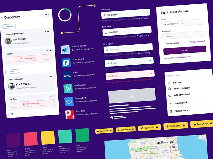
💅 Thumbnails
This way of structuring files will results in more files, to make it easier to search and scan for them, we give them all a thumbnail.
Our thumbnails include the label of the flow and a screen that represents it
🔍 Inside the file
So now you have your files as flows all setup, what’s next?
📖 Pages
We try to avoid having too many pages as this often leads to more confusion when trying to figure out which page you should be reading.
Our Figma pages often look like this:

PS: Labelling things with emojis is super helpful! They are basically free icons that would help with quick recognition 👀
🧶 Frame layouts
When it's time to start adding frames into Figma, we keep it in an F pattern.
Main flows are placed in a row, and each of its steps is placed next to each other, reading left to right.
Which will look something like this
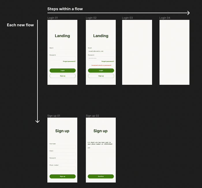
You can do it any way you like for this, but just make sure that it is consistent and everyone knows in what order to read it.
🏷 Labels
In addition to the layout, we also make use of labels. By labelling the screens, we give them context in terms of where they sit in the whole picture. This also gives everyone reading the designs an understanding of the screen.
We’ve found this to be even more important when the designs are complex and have a lot of different variants.
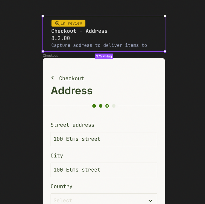
This label would consist of; the screen number; an optional note on the whole screen; and the progress state of it.
The screen number is a way to quickly refer to a screen in discussions or in briefs, with pinpoint precision.
3.x.xx: The flow
x.1.xx: The steps within the flow
x.x.00: The variation of that step
This labelling idea was originally from Luis Ouriach, you can find the Figma link to that file here.
Ioann De also made a really nice version of it as well, which you can find here
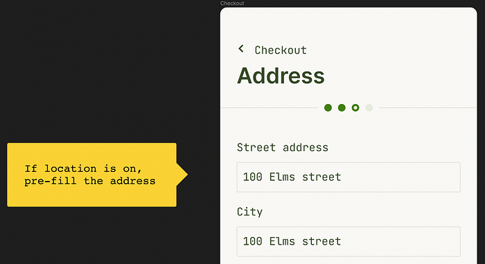
💬 Annotations
In addition to the labels, we also make use of annotation notes. This is to indicate something that happens in the background.
We typically don’t use Figma comments for this, as we reserve the comments for discussions and revisions. They are also often hidden, and easily missed by other teams.
🧿 A single source of truth
After following all the above steps we would end up with quite a few files and screens. As well organised as it is, it becomes hard to get the overall big picture.
As a way to have a single source of truth, we take all the screens from the different files and put them into 1 big FigJam. 🥘

🔀 Why this approach?
FigJam does a better job at handling a large number of screens, it’s also a better environment for discussion and presentation, and your engineers or PMs might use FigJam more than Figma so they are probably a lot more familiar with that tool.
FigJam also enables us to easily add in user flows in the form ➡️. This approach enables us to easily think about what happens outside of the design or in the background of the screens (ex. notifications, logic, user role)
⚠️ FigJam currently does not update the screen when you change the designs in Figma, making updates a bit costly, as you have to copy-paste them back into FigJam 😩 (It’s a heavily requested feature: link 👈)
If this is an issue for you, you can always try miro or overflow
🧪 Experimenting
🎋 Branching in Figma is currently only available on the organization plan.
Branching is a great place to safely experiment and iterate on your Figma designs. 👩🔬
Once you are at a point in your experiment to showcase it, you can pull in other designers in your team to review it, and once you are all happy with it, you can merge it into the main file.
A quick tip with branches: if you want to user test your prototypes, you can make a new branch and do your user testing there without interrupting the designs.
Looking for a summary?
You’ve scrolled too far! It's at the top of this article 👆